Chapter 8
Technology — Make Help Easier to Reach
At a Glance
The central idea: Technology should remove work from care, not add another place to do it.
What you’ll explore: How the pathway becomes reachable through the routes people can actually use. Follow Ellen, Maya, Daniel, and Pat as they choose different ways to receive information, ask questions, and participate. Examine familiar controls, accessible content, first-use assistance, permissions, and alternatives when digital tools are not useful.
Design and AI: Begin with one meaningful task rather than a tour of features. Show what happens, make help visible, and preserve choice. Explore how an approved AI assistant could explain instructions, prepare accessible drafts, and support staff—without becoming a barrier between someone and a person.
Put it to work: Create a First-Use and Multi-Channel Access Plan covering the task, preferred route, permissions, assistance, fallback, and review.
Evidence and evaluation: Examine accessibility standards, human-centered design, behavioral models, and research on technology use by older adults and caregivers. Measure successful tasks, useful support, privacy, access, and total effort—not accounts created or time spent online.
“The power of the Web is in its universality. Access by everyone regardless of disability is an essential aspect.”
— Tim Berners-Lee, inventor of the World Wide Web, in W3C’s accessibility statement.61
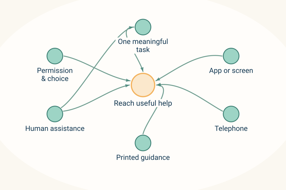
Begin with one meaningful task to define the help someone needs. An app or screen can offer a route to the help. Telephone access offers another route to the same support. Printed guidance offers another route without requiring digital participation. Human assistance is available where someone gets stuck. Permission and choice govern access and any shared use. First-use assistance helps the person attempt their own task. Accessible routes should preserve the same facts; success is useful support, not becoming more digital.
A chosen route | The same responsibility |
Print or telephone | The person receives current information and knows who will answer. |
Accessible digital route | The same service facts, choices, and human help remain visible. |
Personal assistance | Support first use without making another relative responsible by default. |
In context
In Context — “Do we all need to do this?”
Maya could see the value of having the agreed information in one place.
“I’d use this,” she said, looking at the proposed family view. “Especially when we’ve had a meeting and I want to check what we actually decided.”
Ellen held the printed summary Sam had prepared.
“This is enough for me most of the time.”
Daniel looked between the page and the screen.
“Do we all need accounts for this to work?”
“Not for every part of it,” Sam replied. “Let’s begin with what each of you needs to do.”
Maya wanted to find the information her parents had agreed to share and prepare questions for the next conversation.
Daniel wanted the details of responsibilities he had accepted, without having to search through every family exchange.
Ellen wanted a short summary, someone to call, and a dependable way to hear when an arrangement changed.
Pat wanted to see his upcoming plans and keep reading with the grandchildren.
“The television has been doing quite well,” he said. “I haven’t asked it to manage my appointments.”
“Then we don’t need to put them there,” Sam replied.
They were not four versions of the same user.
They were four people trying to do different things.
The design needed to begin with that difference—not with an instruction that everyone learn the same system.
Make the pathway reachable
Chapter 7 connected content, contacts, calls, meetings, visits, and review into a planned sequence of support.
Technology now has a practical job: help people reach and use the parts that matter to them.
The original CarePhysics Technology principle describes a collaborative environment with shared resources, calendars, phone books, content, communication, and tools for care teams. Its emphasis is broader than one application or device.
The practical question is: can each person use the designed pathway through an appropriate route, with assistance when needed?
Technology should remove work from care, not add another place to do it.
That does not mean technology requires no learning, setup, or maintenance. It means those demands must be justified by what people receive in return.
A family should not have to become proficient in a care platform before discovering whom to call. A staff member should not have to enter the same information repeatedly so that a dashboard appears complete. A person should not lose access to an appropriate service because they prefer the telephone.
The technology is there to support the relationship and the work—not become another relationship everyone must maintain.
Start with the useful task, not the whole system
A family’s first question is rarely, “What are all the features?”
It is more likely to be, “Where is the information we agreed on?” or “How do I ask about next week?”
Start there.
A tile can hold an explanation, video, article, or question. A phone-book entry can make a verified contact easier to find. A calendar can present arrangements. A shared session can help people look at something together. A staff workspace can support review and follow-through.
Those possibilities are relevant only when they serve a recognizable task.
Do not make people understand how the entire collection fits together before letting them use one useful part. Keep permissions and partner responsibilities visible rather than making separate organizations appear to be one service.
For Maya, the first useful task might be finding the latest approved family summary.
For Ellen, it might be saving Lena’s contact in the phone she already uses—or receiving a readable contact card.
For Daniel, it might be checking the time of the appointment he has agreed to help with.
For Pat, it might be choosing a story without navigating through unrelated care information.
These are possible starting points, not assignments based on age or family role. Ask each person.
The unfamiliar remote, again
At home, you know how your television works. In someone else’s house, you may face an unfamiliar remote, a different sequence, or two controls that seem to do the same thing.
The task has not become unreasonable. The design has become unfamiliar.
Care technology can create that experience repeatedly.
A help button moves. A familiar action acquires a new label. A page shows an icon without explaining it. A survey opens differently from the article beside it. An update changes the route someone has just learned.
We should not make people relearn the controls whenever we offer something new.
W3C’s guidance on consistent navigation calls for repeated navigation to appear in a predictable relative order. The purpose is to help people anticipate where recurring functions will be, including when they use magnification or other ways of navigating.49
The CarePhysics application is to preserve familiar action labels, help routes, and expectations across related experiences. That does not require every screen to look identical. A telephone display and a television need different layouts.
Keep the meaning and behavior recognizable.
And keep this analogy where it belongs: it explains a design problem that anyone can encounter. It is not an illustration of Pat’s dementia.
Offer different routes without creating different truths
A digital route, a telephone conversation, and a printed summary can serve different preferences while carrying the same approved facts.
That takes deliberate work.
Someone must identify the current version, decide which changes require direct communication, and ensure that people relying on paper or calls are not left with obsolete arrangements.
In the family’s situation, the additional Tuesday from Chapter 7 remains unconfirmed. It should not look confirmed in Maya’s view while Ellen’s paper says a request is pending. Nor should the family be expected to resolve the discrepancy.
The responsible service needs to correct it and communicate through the agreed routes.
A useful service may provide a guide in print and a schedule in an accessible format. Keep requests, approvals, waiting-list decisions, and confirmed arrangements distinct in every route. Verify which alternatives the local service actually supports; dated examples appear in Appendix J.
An alternative route should provide timely access to the essential support, not an identical copy of every digital feature.
Ellen does not need an animated calendar on paper. She needs to know what is arranged, what is not, and who will contact her.
Design accessibility into the ordinary experience
Accessibility is not a special version prepared after the main design is finished.
W3C’s Web Content Accessibility Guidelines 2.2, or WCAG 2.2, provide testable requirements for web content. For the digital examples in this book, WCAG 2.2 at Level AA is a useful baseline design target. It is not a claim that a particular product conforms, and conformance alone cannot address every individual need.62
Begin with practical questions.
Can the person perceive the important information? Can they operate the controls? Can they understand what an action will do? Can their assistive technology work with the experience?
Readable text, appropriate contrast, meaningful labels, captions, alternatives to visual-only information, keyboard access, and usable controls belong in that assessment. So do understandable errors and enough opportunity to complete a task without unnecessary pressure.62
Then test the actual experience.
A large heading will not repair an unclear instruction. A caption button will not help if the captions are inaccurate. A printable document may still be difficult to read. A video available on a phone may be impractical over the connection someone has.
W3C’s supplemental guidance for cognitive and learning disabilities emphasizes familiar patterns, clear content, manageable processes, help, and involvement of people with those disabilities in design and testing. It extends beyond the formal WCAG conformance requirements.63
Ask about the person’s language, devices, connectivity, setting, preferred assistance, and ability to use a private space. Do not turn those questions into a test of whether they deserve the service.
Culture and beliefs may influence what support someone welcomes, but they do not tell us which interface that person can use. Ask rather than infer. The organization’s access plan should reflect the answers, not a demographic stereotype.
Make sign-in usable without making privacy optional
For public information, consider whether an account is necessary at all.
A general introduction to a Day Center or a public activity handout may not need the same access process as a private family summary. Do not collect personal information merely because the platform offers a registration form.
Private care information needs an appropriate protection process. That process also needs to be usable.
W3C’s accessible-authentication guidance addresses barriers created by memory tests, puzzles, and unnecessary transcription. It describes support such as properly implemented password-manager access, autofill, and copy-and-paste rather than requiring people to remember and manually reproduce credentials.64
The design question is not whether to choose security or accessibility. It is how to provide appropriate protection through methods the intended people can use.
Test recovery too. What happens when an invitation expires, a device is replaced, or someone cannot use the usual verification method?
Provide a legitimate route to assistance. Staff should not solve the problem by asking someone to disclose a password or by encouraging relatives to share an account.
Family access should identify who is acting and what they are authorized to see or do. Being a daughter, son, or spouse should not silently become permission to access everything.
Keep setup assistance separate from taking over the person’s identity.
Show the first task—and let the person do it
A tour can show where features are. First-use support should help someone do something worthwhile.
AHRQ’s communication guidance recommends limiting key points, demonstrating actions, inviting questions, and checking understanding. Those methods provide a useful foundation for introducing a care tool without overwhelming someone with every possibility.6
A first-use invitation might say:
“We can help you find the current summary and see where questions go. We will only look at the information you are permitted to access. You can try it yourself, ask us to guide you, or use the telephone or printed version instead.”
Then demonstrate the chosen task on the actual device and configuration, using a safe example where needed.
In context
In Context — One thing she can find again
Ellen wanted Lena’s number where she could find it without searching through papers.
With her agreement, Sam helped her save the contact in her phone.
“What should I call it?” she asked.
“Something you will recognize.”
She entered the Day Center’s name and Lena’s role. They checked the number against the center’s current information.
Sam did not continue into a tour of unrelated features.
“Could you show me where you would find it again?”
Ellen returned to the contact.
“There.”
They also checked the opening hours and the route for a question when Lena was unavailable. Ellen kept the printed contact information as well.
Maya’s first task was different. With her own authorized access, she located the approved summary.
“Who sees a question I send from here?” she asked.
“That needs to be clear before you send one,” Sam said.
They reviewed the actual recipient information together. Where a channel did not provide the privacy Maya needed, they chose an approved private contact route instead.
Neither task was impressive as a technology demonstration.
Both answered a question the family actually had.
The point of first use is not to prove that someone can manage without help. It is to establish a workable route, including appropriate assistance.
Some people will want to practice. Some will prefer continuing support. Both should be planned honestly.
Put human help where the person gets stuck
Help is not useful merely because a support page exists.
Place the route near the task, explain what the responder can help with, and state when someone is available. Distinguish technical assistance from clinical or program decisions.
A technical support person may help Maya open a summary. They should not interpret Pat’s clinical findings. Lena can explain a program arrangement. She cannot resolve every account problem without the appropriate technical support.
W3C’s Consistent Help criterion requires recurring help mechanisms to appear in a consistent location relative to other content. It does not require round-the-clock human staffing. The accompanying guidance encourages clear availability information and ways to express a question in the person’s own words.65
CarePhysics goes further as a service-design proposal: when we invite questions, we should assign responsibility for answering them.
The dated Day Center export describes tile feedback that saves a response and sends an email notification to the center, with comments available where enabled. That establishes a delivery mechanism. It does not establish that a staff member has answered or resolved the concern.
A callback request needs an owner and a stated response expectation. An automated receipt should not sound like a professional has already acted.
People should not have to complete a chatbot conversation before they can ask for a person.
Make shared use genuinely permissioned
Technology can help people read, plan, or examine information together across a room or across a distance.
The useful experience may be simple: “We are looking at the same page.”
But shared viewing needs boundaries.
Before starting, explain what the helper can see, whether they can control anything, and how to end the session. Limit the shared area to the task. Keep unrelated records, credentials, notifications, and private notes outside it.
These are requirements for the proposed experience, not protections to assume every screen-sharing tool already provides. Where the available configuration cannot support an appropriately limited session, use a safer demonstration or another route.
The Day Center export describes co-browsing and shared educational experiences. It separately labels some AI participation in sessions as planned. The exact permissions, devices, and deployed configuration still need verification before an organization promises a particular experience.
For Pat’s family television, the shared material is the story—not the care record.
Emma and Noah can choose a page, read, listen, or make a joke. They do not need access to adult conversations or responsibility for technical support.
Pat can benefit from the prepared experience without managing another account. That does not mean excluding him from digital tools he wants to use. It means making the choice with him.
Personalize the help, not the location of every button
Personalization should make the experience more relevant without making it unpredictable.
Offer a suitable language, accessible format, appropriate level of detail, and relevant resources. Keep core actions recognizable.
A tile containing a video and article should make both options easy to find. A survey should explain its purpose and who receives the answer. A message should distinguish information from a request. A contact should make its role and availability clear.
The familiar CarePhysics content pattern still applies: why it matters, the main idea, demonstration, a chosen next step, questions or connection, and what follows. The format can be brief when the task is brief.
A help video might demonstrate how to locate a confirmed appointment, then show what to do when the status is still “requested.” The companion article can provide the same instructions in a readable format. A person offering telephone help should use the same action names.
An update should not make those instructions obsolete without warning.
When a design must change, explain what changed, preserve familiar functions where possible, and offer assistance. Let feedback influence whether the change stays.
Consistency is something the organization maintains over time—not a visual style chosen at launch.
Design for the interrupted day
Test what happens when use does not proceed perfectly.
A connection drops during a meeting. A session ends while a staff member is drafting. A person submits a request twice because no confirmation appeared. A printed copy is no longer current.
The experience should explain what was saved, what was sent, what remains incomplete, and what to do next.
Do not claim that a request succeeded when delivery is uncertain. Do not invite a second submission without checking whether the first arrived. Provide a responsible person who can reconcile the situation.
Test what happens when unfinished work is interrupted. A draft should not be treated as saved until storage and recovery have been verified. Do not publish an unreviewed family note merely to preserve it; the dated persistence issue is recorded in Appendix J.
A recoverable draft is a requirement to verify, not a feature to assume.
Plan for outages as well. Identify essential information staff need, an approved fallback process, the people responsible for contacting families, and how records will be reconciled afterward.
Paper is not automatically private or current. It needs appropriate handling, dates, and replacement just as digital information does.
Reliable access includes returning after something goes wrong.
Give the staff less to reconstruct
The technology should support the people delivering care as well as those receiving it.
Ask staff to show how the work happens now. Where do they enter the same information? What do they have to reconstruct at the end of the day? Which changes require checking before information is reused?
W3C’s guidance on redundant entry addresses unnecessary re-entry within a process, while preserving exceptions such as security or information that is no longer valid. It provides one useful design reference; it does not justify carrying old information forward without checking it.66
Recording a group activity once can reduce repeated entry only if individual accounts remain accurate and correctable. Examine the full work, including review and correction. Appendix J records the dated configuration; any time benefit needs local measurement.
The distinction matters. Fewer clicks may help, but inaccurate group assumptions can create correction work or misleading records.
Staff should have ways to suggest improvements, identify awkward steps, and practice changes without feeling that every hesitation is being evaluated. Record the issue in the design—not a judgment about the person encountering it.
Technology can carry useful staff knowledge into guidance and training. The organization should credit that contribution and show what changed because of it.
Remove work; do not merely move it
Apply the constraint question to the complete task. A shorter staff form may look efficient while requiring a family to enter the same information at home. Faster AI drafting may enlarge a review queue. In either case, the local improvement has not yet established a better care experience.
Follow one ordinary request across the person, family, staff, and receiving partner. Identify duplicated entry, missing information, correction work, and waits for an accepted responsibility. Ask which change would make useful support easier to obtain. Accuracy and clear sources may release more review capacity than producing more drafts.
Keep phone, print, digital, and supported routes in the same review. No route should quietly make one caregiver responsible for relaying every update. Credit the people who identify a better arrangement, provide training and coverage, and check total effort before claiming a saving. See the pathway flow measures in Appendix F.
AI can assist without becoming another set of controls
An approved AI assistant could help people use a system they do not yet know well.
It might explain where to find a resource using the organization’s current instructions, help someone phrase a question, or prepare a shorter explanation of a nonclinical process.
For staff, it could help turn a useful explanation into a draft help article, compare instructions with an updated screen, or organize voluntary feedback about recurring difficulties.
Begin with the relevant approved material, not a general request to “help the user.”
A proposed assignment might be:
Using the current interface guide and approved support information, prepare instructions for finding a family summary. Keep the actual action labels. Explain what the person can do if access fails, and identify the human support route. Mark anything the sources do not establish.
The interface owner checks that the instructions match the product. The service lead verifies contacts and response expectations. An appropriate reviewer checks language and accessibility. Private personal information is unnecessary for preparing a generic guide.
The knowledge collection should preserve sources, owners, review dates, permissions, and corrections. Research, design guidance, local facts, fictional examples, and personal context remain distinct. Chapter 13 explains how to maintain this reviewed knowledge and use it responsibly.
Uploading the book does not train a model or establish that it will follow the guidance.
Properly applied, AI can be a gift here: less repetitive preparation, more tailored assistance, and routine explanations available when questions arise. It can help someone get ready for a human conversation rather than wait in uncertainty for every basic answer.
The boundaries still need to be clear. An assistant must not invent a button, claim a request was submitted when it was not, or interpret technical difficulty as a clinical finding. It should never ask for passwords or private verification codes.
Around-the-clock AI availability is not around-the-clock professional care. State when human support is available, provide appropriate urgent routes, and make escalation easy.
A simpler screen, a printed guide, or a person on the telephone may be the better answer. AI should not stand in the way of any of them.
In context
In Context — A reliable route without an app
An original fictional illustration, separate from the continuing family.
A person living alone wants help arranging a home-support visit. He prefers a telephone call and a printed page. The service does not ask him to recruit a relative to manage an account.
The coordinator checks the number and the times he wishes to be called, explains who will respond if the usual coordinator is away, and mails a concise confirmation after the arrangement is accepted. A later change uses the contact route he agreed to.
An assistant may help staff prepare the printed information from verified records. He does not need to interact with it. The useful result is a dependable route to the service, not an account created on his behalf.
Put first use and continuing access in one plan
The practical output is a First-Use and Multi-Channel Access Plan.
Build it around tasks and preferences, not around a list of people who have not activated an account.
Person or role | First useful task and chosen route | Support and boundary |
|---|---|---|
Pat | Review his relevant plans directly with a person or readable summary; enjoy prepared stories on the shared television. | Include him in choices. Offer other digital access when he wants it. Keep private care information off the family activity screen. |
Ellen | Find the correct contact and receive a short current summary by her preferred route. | Provide calls for agreed changes and an accessible written copy. She is not responsible for relaying every update to everyone else. |
Maya | Find the approved information shared with her and prepare a question through an appropriate channel. | Use her own authorized access. Make recipients and privacy boundaries visible. |
Daniel | Locate details of a responsibility he has actually accepted. | Confirm the information and change-notification route. A calendar entry does not create a new commitment. |
Day Center staff | Review and share an accurate update without unnecessary reconstruction. | Provide training, protected review time, correction tools, technical help, and an outage process. |
Sam and partner teams | Reach relevant, permissioned information for their own responsibilities. | Preserve separate professional roles and explicit handoffs. Do not assume every system automatically exchanges information. |
For a real implementation, add the named owner, actual contact details, device and format requirements, assistance offered, fallback route, and review date.
This is a proposed planning aid, not a validated assessment.
A person can change their preferred route. Their access plan should change with them.
Resource the support behind the interface
An organization choosing technology is also choosing work it must support.
Budget for setup, training, accessibility testing, interpretation, devices where needed, connectivity, maintenance, human review, and responding to questions. Consider the work created by running digital and nondigital routes together.
Ask who provides help when the usual champion leaves or is absent. Clarify what the organization can export, in which formats, and what it can continue using if the supplier changes.
The dated Day Center materials themselves identify cost, implementation, continuity beyond one champion, and what information can leave with the organization as questions requiring explicit answers.
A demonstration should cover those realities, not only the ideal route.
Ask to see first use, a mistaken entry, a permission change, a failed connection, and an unfinished draft. Distinguish what is proposed, implemented, tested, and deployed in this setting. None of those labels automatically establishes improved care.
The same discipline applies in a health system, home-care organization, independent-living community, or Day Center. The tasks differ; the need for usable access and accountable support remains.
Community and state groups can help identify shared barriers and support local solutions. One organization may need language access; another may need connectivity or staff capacity. Shared design guidance should not conceal those differences.
Genus supplies technology. Partners retain their care, staffing, programs, relationships, and voice. A connected experience must not obscure that responsibility.
How would we know it helped?
Choose one meaningful task and establish a baseline.
For example: can an authorized family member find the current arrangement and identify whom to contact about a change?
Test it through the routes people will actually use, including assistance. Record whether the task was completed, what help was needed, where the design caused difficulty, and whether the person reached a useful result.
Distinguish completed independently, completed with chosen assistance, not completed because of a barrier, and not wanted. Those are different findings. Assistance is not failure.
For an initial four-week local review, define the population offered the process, the number who tried it, the number who provided feedback, and the version tested. Include people whose sign-in failed or who chose telephone or paper—not only those visible in the app.
Ask about time, frustration, privacy, repeated entry, and unanswered questions. Count staff work alongside family effort. A reduction in family effort may be worthwhile even when it requires staff support, but the trade-off should be visible and resourced.
Keep the stages separate: invitation, access, first useful action, continuing use, received support, outcomes, and attributable impact. The research review informing this book makes those distinctions explicit and includes burden, equity, and safety.
Willingness to recommend is not an actual referral, and a referral is not another person receiving help.
Give a named leader authority to act on the findings. Change an unclear label. Repair a failed recovery route. Restore human assistance. Pause a rollout that increases unsafe work or excludes people.
We are evaluating whether the support is reachable—not whether the family is sufficiently digital.
Models and Evidence Behind This Chapter
The following standards and research help examine the chapter’s design choices. The PRISM trial concerns a particular intervention and population; it does not establish a Genus effect.
Accessibility standards and cognitive-accessibility guidance
Test the route, not just the appearance
Foundation and use. WCAG 2.2 provides testable web-accessibility requirements. W3C’s additional cognitive-accessibility guidance addresses familiar patterns, clear instructions, support, and participation of users in design. It is supplemental guidance, not an additional conformance level.62
Where we used it. Predictable navigation, accessible sign-in, readable content, visible help, and alternatives to unnecessary re-entry.
Evidence boundary. Standards establish design requirements, not clinical effectiveness. Neither an automated check nor an attractive interface establishes that the whole experience works for the intended audience.
Local question: Can people complete the relevant task with their actual devices, abilities, preferences, and available support?
COM-B and diffusion of innovations
Investigate the barrier before blaming adoption
Foundation and use. COM-B distinguishes capability, opportunity, and motivation. Rogers’ diffusion framework asks about an innovation’s relative advantage, compatibility, complexity, trialability, and observable value. The research review informing this book uses these ideas to examine both family access and professional adoption.
Here, they support beginning with a useful task, allowing a supported trial, and checking whether a tool fits the person’s life and the team’s work.
Evidence boundary. These are explanatory and design frameworks. Their relevance does not establish that a particular onboarding process improves care. The research review informing this book distinguishes conceptual support from intervention evidence.
Local question: Is the obstacle unclear value, an unusable interface, unavailable access, lack of support, or a choice not to use the tool?
PRISM: technology with training and support
Evaluate the complete offer
Supporting trial. Sara Czaja and colleagues’ PRISM randomized trial, published in the 2018 volume of The Gerontologist, included 300 older adults at risk of social isolation across three U.S. sites. It compared a specially designed computer system with a binder containing similar printed information.
The technology package included equipment, internet access, training, and support. At six months, the PRISM group reported less loneliness and greater perceived social support and well-being. Those between-group advantages were not maintained at 12 months. Computer confidence and proficiency improved.
Important limits. The study excluded people with cognitive impairment and certain sensory or motor limitations. It does not establish the same effects for Pat, isolate the value of the interface from the support package, or validate Genus.67
Local question: What equipment, preparation, and human assistance are necessary for this particular offer to be useful?
Caregiver applications and care coordination
Potential is not the same as demonstrated benefit
Supporting review. Marjorie Kelley and colleagues’ 2024 scoping review identified 34 papers representing 25 studies of caregiver applications. The evidence was largely qualitative, pilot, or feasibility work. The review identified needs involving information, support, communication, and care coordination, but found no included study directly evaluating an integrated caregiver-app intervention for care planning and coordination among people with multiple chronic conditions.
Important limits. The literature search extended through June 2021. The finding describes that review’s included evidence—not every application available now. It does not establish that caregiver technology is ineffective, but it limits claims about demonstrated coordination outcomes.68
Where we used it. The chapter treats app use, communication, practical help, and caregiver outcomes as separate evaluation questions.
Local question: What changes in the person’s care or workload beyond gaining another channel?
Clear communication and supported first use
Demonstrate something worth doing
Practice foundation. AHRQ recommends understandable explanations, demonstrations, questions, and checks of understanding. Its materials guidance also emphasizes evaluating whether information is understandable and actionable.6
Where we used it. First use begins with a chosen task rather than a complete feature tour. The person can practice, ask for help, or choose another route.
Evidence boundary. This is practice guidance, not a trial of the proposed first-use plan. A technically successful action may still fail to deliver useful support.
Local question: Did the introduction leave the person able to do something they value and find help when they need it?
One thing to try
Choose one essential task in your current service.
Invite an intended user to try it using their usual device or preferred nondigital route. Explain that you are testing the design, not them. Observe without immediately taking over, while providing agreed assistance whenever needed.
Then test the route back from a problem: an expired invitation, a mistaken entry, or uncertainty about whom to contact.
Fix one point where the process makes the person work unnecessarily.
Your team’s question is:
What are we asking people to learn, repeat, or manage that the design could handle more respectfully?
Reaching the information is only the beginning
In context
In Context — A question worth bringing
At home, Ellen placed the current summary beside the telephone.
Maya had found her permitted information. Daniel knew where to check the details of his accepted task. Pat had the next story ready for another evening with the grandchildren.
The additional Tuesday remained unresolved. Sam was still responsible for reporting back through the route they had agreed.
“I know where to find things now,” Ellen said during their next call. “What I’m wondering about is how to explain the evenings.”
“What would you like us to discuss?” Sam asked.
“Some evenings feel harder to organize. Pat doesn’t see it quite the same way.”
Pat was beside her.
“I think we’re both tired of talking about what needs doing.”
“That can stay in the question too,” Sam said.
The technology had helped them reach the information and the person.
The next opportunity was to help them prepare for a better conversation: bring together the questions they chose to share, the Day Center’s reviewed observations, and the relevant professional guidance—without pretending those sources all said the same thing.
Access made the material reachable.
The next principle asks how assistance can make that knowledge useful while keeping judgment and responsibility with people.
Notes
Agency for Healthcare Research and Quality (2024). Communicate Clearly: Tool 4. Health Literacy Universal Precautions Toolkit, 3rd edition. Source (opens a new tab)
World Wide Web Consortium. Understanding Success Criterion 3.2.3: Consistent Navigation. Understanding WCAG 2.2. Source (opens a new tab)
World Wide Web Consortium. Accessibility. W3C mission and web-accessibility statement. Source (opens a new tab)
World Wide Web Consortium (2023). Web Content Accessibility Guidelines (WCAG) 2.2. W3C Recommendation. Use the current normative text and relevant implementation guidance. Source (opens a new tab)
World Wide Web Consortium (2021). Making Content Usable for People with Cognitive and Learning Disabilities. W3C Working Group Note. Source (opens a new tab)
World Wide Web Consortium. Understanding Success Criterion 3.3.8: Accessible Authentication (Minimum). Understanding WCAG 2.2. Source (opens a new tab)
World Wide Web Consortium. Understanding Success Criterion 3.2.6: Consistent Help. Understanding WCAG 2.2. Source (opens a new tab)
World Wide Web Consortium. Understanding Success Criterion 3.3.7: Redundant Entry. Understanding WCAG 2.2. Source (opens a new tab)
Czaja SJ, Boot WR, Charness N, Rogers WA, Sharit J (2018). Improving Social Support for Older Adults Through Technology: Findings From the PRISM Randomized Controlled Trial. The Gerontologist. 58(3):467–477. DOI: 10.1093/geront/gnw249. Source (opens a new tab)
Kelley MM, Powell T, Camara D, et al. (2024). Mobile Health Apps, Family Caregivers, and Care Planning: Scoping Review. Journal of Medical Internet Research. 26:e46108. DOI: 10.2196/46108. Source (opens a new tab)